It is Getting Warm in Here!

Climate change and temperature anomalies
The whole world is talking about climate change and global warming. Let’s look at the data from Combined Land-Surface Air and Sea-Surface Water Temperature Anomalies in the Northern Hemisphere at NASA’s Goddard Institute for Space Studies and analyze if the data confirms global warming.
Loading, inspecting and selecting data
Loading data
As first step, I load the data with the function read_csv().
#I use: data on the *Combined Land-Surface Air and Sea-Surface Water Temperature Anomalies* in the Northern Hemisphere at [NASA's Goddard Institute for Space Studies](https://data.giss.nasa.gov/gistemp) and the [tabular data of temperature anomalies can be found here](https://data.giss.nasa.gov/gistemp/tabledata_v3/NH.Ts+dSST.txt)

#I load this file using read_csv, skipping the first (redundant) row and coding NASAs NA's (***) as "na"

weather <-
  read_csv("https://data.giss.nasa.gov/gistemp/tabledata_v3/NH.Ts+dSST.csv",
           skip = 1,
           na = "***")
Inspecting data
Then, I inspect the data to detect the structure of the dataset, verify data types and missing observations.
#I inspect the dataframe's key variables and structure using skim
skim(weather)| Name | weather |
| Number of rows | 140 |
| Number of columns | 19 |
| _______________________ | |
| Column type frequency: | |
| numeric | 19 |
| ________________________ | |
| Group variables | None |
Variable type: numeric
| skim_variable | n_missing | complete_rate | mean | sd | p0 | p25 | p50 | p75 | p100 | hist |
|---|---|---|---|---|---|---|---|---|---|---|
| Year | 0 | 1.00 | 1949.50 | 40.56 | 1880.00 | 1914.75 | 1949.50 | 1984.25 | 2019.00 | <U+2587><U+2587><U+2587><U+2587><U+2587> |
| Jan | 0 | 1.00 | 0.04 | 0.53 | -1.47 | -0.35 | 0.00 | 0.35 | 1.55 | <U+2581><U+2585><U+2587><U+2583><U+2581> |
| Feb | 0 | 1.00 | 0.08 | 0.53 | -0.89 | -0.36 | -0.02 | 0.46 | 1.92 | <U+2586><U+2587><U+2586><U+2582><U+2581> |
| Mar | 0 | 1.00 | 0.10 | 0.51 | -0.77 | -0.27 | 0.01 | 0.34 | 1.83 | <U+2586><U+2587><U+2583><U+2582><U+2581> |
| Apr | 0 | 1.00 | 0.06 | 0.45 | -0.68 | -0.27 | -0.02 | 0.26 | 1.42 | <U+2585><U+2587><U+2583><U+2582><U+2581> |
| May | 0 | 1.00 | 0.04 | 0.39 | -0.74 | -0.23 | -0.02 | 0.22 | 1.03 | <U+2582><U+2587><U+2587><U+2582><U+2582> |
| Jun | 0 | 1.00 | 0.05 | 0.38 | -0.56 | -0.20 | -0.04 | 0.19 | 1.15 | <U+2585><U+2587><U+2583><U+2582><U+2581> |
| Jul | 0 | 1.00 | 0.05 | 0.35 | -0.60 | -0.18 | -0.02 | 0.14 | 1.02 | <U+2583><U+2587><U+2583><U+2582><U+2581> |
| Aug | 1 | 0.99 | 0.04 | 0.36 | -0.76 | -0.21 | -0.04 | 0.17 | 1.08 | <U+2582><U+2587><U+2586><U+2582><U+2581> |
| Sep | 1 | 0.99 | 0.06 | 0.36 | -0.70 | -0.17 | -0.01 | 0.20 | 1.18 | <U+2582><U+2587><U+2585><U+2582><U+2581> |
| Oct | 1 | 0.99 | 0.11 | 0.40 | -0.81 | -0.17 | 0.04 | 0.27 | 1.24 | <U+2581><U+2587><U+2587><U+2582><U+2582> |
| Nov | 1 | 0.99 | 0.08 | 0.44 | -0.81 | -0.23 | 0.04 | 0.28 | 1.35 | <U+2583><U+2587><U+2587><U+2582><U+2581> |
| Dec | 1 | 0.99 | 0.02 | 0.47 | -1.10 | -0.30 | -0.03 | 0.32 | 1.45 | <U+2581><U+2587><U+2587><U+2582><U+2581> |
| J-D | 1 | 0.99 | 0.06 | 0.39 | -0.54 | -0.22 | -0.01 | 0.21 | 1.28 | <U+2586><U+2587><U+2582><U+2582><U+2581> |
| D-N | 2 | 0.99 | 0.06 | 0.39 | -0.54 | -0.21 | -0.01 | 0.22 | 1.31 | <U+2586><U+2587><U+2582><U+2582><U+2581> |
| DJF | 1 | 0.99 | 0.05 | 0.48 | -1.00 | -0.30 | -0.05 | 0.38 | 1.64 | <U+2582><U+2587><U+2586><U+2582><U+2581> |
| MAM | 0 | 1.00 | 0.07 | 0.43 | -0.66 | -0.25 | -0.03 | 0.24 | 1.43 | <U+2585><U+2587><U+2583><U+2582><U+2581> |
| JJA | 1 | 0.99 | 0.04 | 0.36 | -0.54 | -0.20 | -0.03 | 0.15 | 1.07 | <U+2585><U+2587><U+2583><U+2582><U+2581> |
| SON | 1 | 0.99 | 0.08 | 0.39 | -0.67 | -0.21 | 0.01 | 0.23 | 1.24 | <U+2583><U+2587><U+2585><U+2582><U+2581> |
Using the function skim() it is possible to detect missing values and to understand the structure of the dataframe.The dataset has 140 rows and 19 columns. For the relevant period, from August to December in the year 2019, there are only 5 relevant NA values (5 missing values). Further, since each month observation forms a different column/variable, the dataset is in “Wide” format.
Selecting variables and tidying the dataframe
I select the year and the twelve month variables from the weather dataset. I will not use the others (J-D, D-N, DJF, etc.) for this analysis. I convert the dataframe from wide to ‘long’ format, that means that I create a separate row for every month. I name the new dataframe as tidyweather, the variable containing the name of the month as month, and the temperature deviation values as delta.
tidyweather<- weather %>%
  select(1:13) %>% #I am selecting the year and the monts Jan-Dez
  pivot_longer(names_to= "month", values_to="delta", cols=2:13) #I convert the dataframe
Plotting Information
I plot the data using a time-series scatter plot, and add a trendline. To do that, I first need to create a new variable called date in order to ensure that the delta values are plotted chronologically.
#I create a new variable, 'date' to ensure delta values are plotted chronologically
tidyweather <- tidyweather %>%
mutate(date = ymd(paste(as.character(Year), month, "1")),#I create a new variable date
month = month(date, label=TRUE),
year = year(date))
#I create a scatterplot with a smooth trendline
ggplot(tidyweather, aes(x=date, y = delta))+ #let's see if the date influeneces the change (delta)
geom_point()+
geom_smooth(color="red",size=0.5) + #I create a smooth trendline
theme_fivethirtyeight() + # I add a theme
labs(x="", y="Deviation From Expected Temperature (°C)",
title = "It's Getting Warmer in Here...", subtitle="Monthly temperature deviations relative to a 1951-1980 base period", caption=" Source: NASA Goddard Institute for Space Studies") + #adding labels
theme(axis.title=element_text()) #add the title (previously deleted by theme-selection)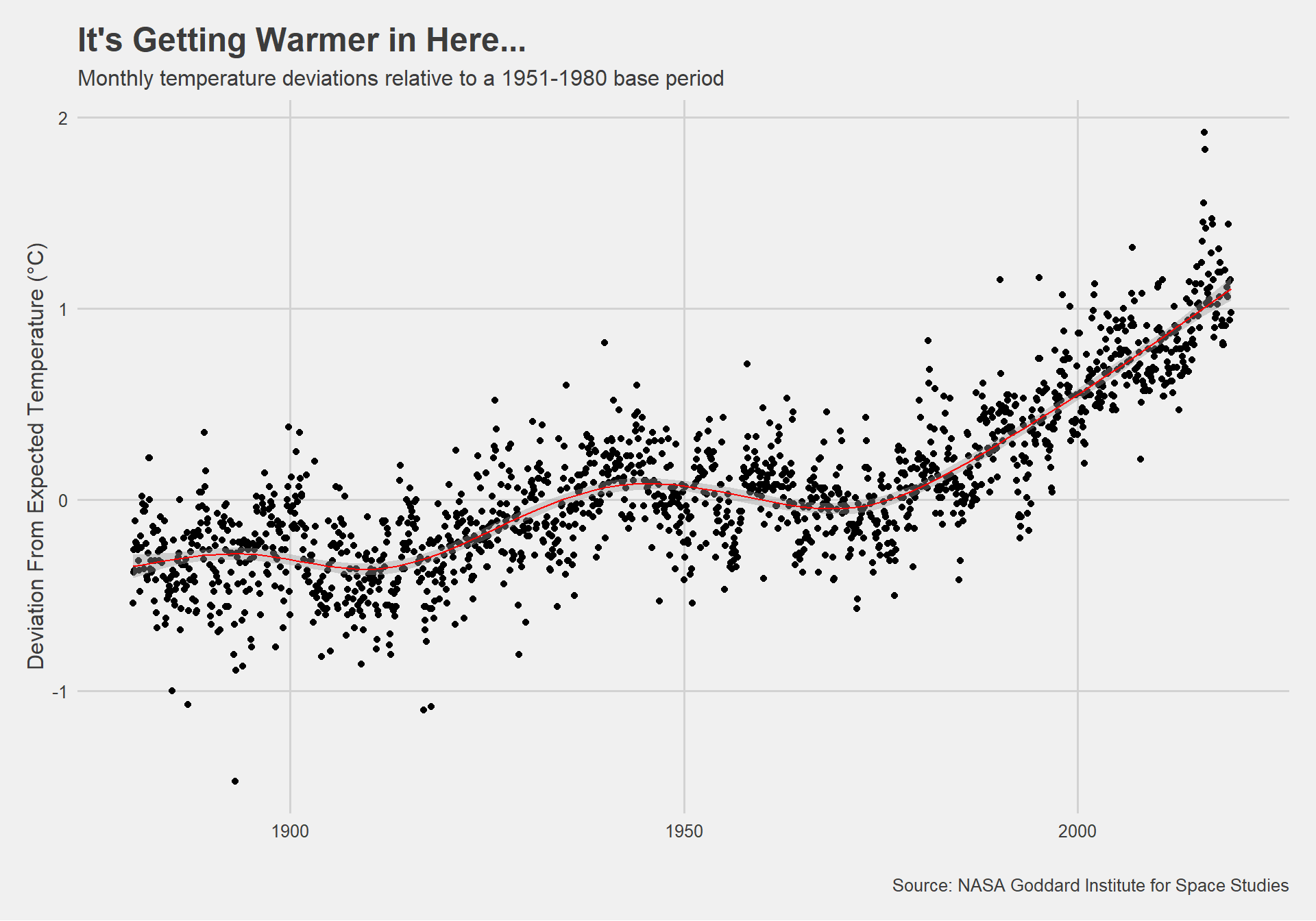 In the scatterplot I see the monthly temperature deviations from 1880-2016 using as a base period the average between 1951-1980. The overall trend seems to be an increase in temperature deviations over the analysed time period. Since 1980, the temperature increase has been even higher.
Is the effect of increasing temperature more pronounced in some months?
I use facet_wrap() to produce a separate scatter plot for each month, again with a smoothing line, to answer this question.
#creating a faceted plot of temperature deviations (delta) by month, across the years surveyed
p1 <- ggplot(tidyweather, aes(x=date, y = delta))+
geom_point()+
geom_smooth(color="red",size=0.5) +
theme_fivethirtyeight() +
labs(x="", y="Deviation From Expected Temperature (°C)",
title = "Do Temperature Anomalies Vary by Month?", subtitle="Temperature deviations by month relative to a 1951-1980 base period, from 1880 to 2019", caption=" Source: NASA Goddard Institute for Space Studies") +
theme(axis.title=element_text()) + facet_wrap(~month) #I facet by month
#creating a plot showing mean monthly temperature deviations across the whole period
p2 <- tidyweather %>%
group_by(month) %>%
summarise(mean=mean(delta, na.rm=TRUE)) %>%
ggplot(aes(x=month, y=mean)) +
geom_point() +
geom_line(group=1,color="red") + #I add group=1 because instead of a line for each month, I want a single line for all months
labs(x="", y="",title="Temperature Deviation is Highest in Spring and Autumn",
subtitle="Mean monthly temperature deviation (1880-2019) relative to a 1951-1980 base period", caption=" Source: NASA Goddard Institute for Space Studies") +
theme_fivethirtyeight() +
theme(axis.title=element_text())
p1+p2 #I want to depict both scatterplots next to each other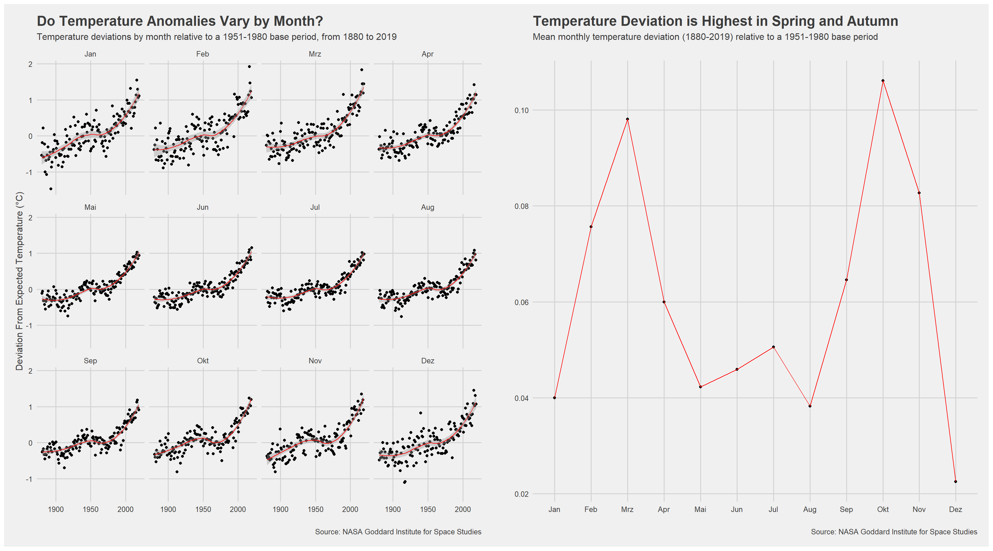 Grouping data
It is sometimes useful to group data into different time periods to study historical data. But first, I inspect the comparison dataframe by clicking on it in the Environment pane.
#creating a new dataframe, 'comparison', which groups data in 5 time periods: 1881-1920, 1921-1950, 1951-1980, 1981-2010 and 2011-present
#I remove data before 1800 using 'filter', and create a new variable 'interval' which contains data on which period each observation belongs to

comparison <- tidyweather %>%
  filter(Year>= 1881) %>%     #remove years prior to 1881
  #create new variable 'interval', and assign values based on criteria below:
  mutate(interval = case_when(
    Year %in% c(1881:1920) ~ "1881-1920",
    Year %in% c(1921:1950) ~ "1921-1950",
    Year %in% c(1951:1980) ~ "1951-1980",
    Year %in% c(1981:2010) ~ "1981-2010",
    TRUE ~ "2011-present"
  ))
Density plot
Now that I have the interval variable, I can create a density plot to study the distribution of monthly deviations (delta), grouped by the different time periods I are interested in. I set fill to interval to group and color the data by different time periods.
#I create a density plot which allows me to study the distribution of monthly temperature deviations across the time periods specified

ggplot(comparison, aes(x=delta, fill=interval))+
  geom_density(alpha=0.2) + #I am changing the transparency
  theme_fivethirtyeight() +
  labs (
    subtitle = "Distribution of monthly temperature anomalies across periods, relative to a 1951-1980 base period", title="Temperature Anomalies have Increased Sharply Across Periods", x="Deviation From Expected Temperature (°C)", y = "Density") +   theme(axis.title=element_text() , legend.title=element_blank())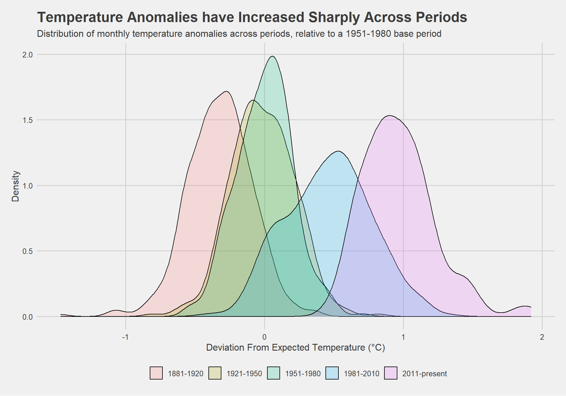
Investigating Average Annual Anomalies
Finally, I investigate average annual anomalies. I calculate the annual average temperature deviation by year and the plot the development in a scatterplot.
#creating yearly averages
average_annual_anomaly <- tidyweather %>%
  group_by(Year) %>%   #grouping data by Year

  # creating summaries for mean delta
  # use `na.rm=TRUE` to eliminate NA (not available) values
  summarise(annual_average_delta = mean(delta, na.rm=TRUE))

#plotting the data:
ggplot(average_annual_anomaly, aes(x=Year, y= annual_average_delta))+
  geom_point()+

  #Fit the best fit line, using LOESS method
  geom_smooth(colour="red",size=0.5) +

  #change to theme_bw() to have white background + black frame around plot
  theme_bw() +
  labs (
    title = "Average Yearly Temperature Anomalies have Increased Exponentially Since 1960", subtitle="Mean annual deviation from expected temperature (°C), relative to a 1951-1980 base period", x="", y = "Temperature Deviation (°C)"
) + theme_fivethirtyeight() + theme(axis.title=element_text()) 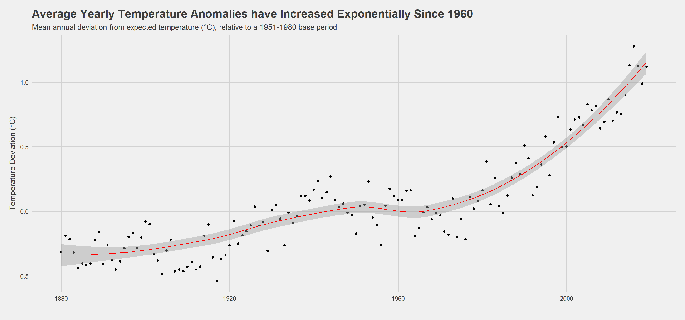
Confidence Interval for delta
Confidence Interval with formula
I construct a confidence interval for the average annual delta since 2011 using a formula.
#A one-degree global change is significant because it takes a vast amount of heat to warm all the oceans, atmosphere, and land by that much. In the past, a one- to two-degree drop was all it took to plunge the Earth into the Little Ice Age.

#Ie run a manual calculation of the confidence interval for average annual delta since 2011
formula_ci <- comparison %>%
  filter(interval=="2011-present") %>%
  summarise(mean_delta=mean(delta,na.rm=TRUE),sd_delta=sd(delta,na.rm=TRUE),count=n(),t_critical=qt(0.975,count-1),se_delta=sd_delta/sqrt(count),margin_of_error=t_critical*se_delta,delta_low=mean_delta-margin_of_error,delta_high=mean_delta+margin_of_error)

formula_ci %>%
  select(c(delta_low,delta_high)) %>%
  kbl(col.names=c("Mean Annual Delta (2011-Present): Lower Limit", "Mean Annual Delta (2011-Present): Upper Limit")) %>%
kable_styling()| Mean Annual Delta (2011-Present): Lower Limit | Mean Annual Delta (2011-Present): Upper Limit |
|---|---|
| 0.916 | 1.02 |
This manually calculated confidence interval demonstrates that the 95% confidence interval for average annual delta, from 2011-present, is 0.916-1.02.
Confidence Interval with bootstrap
I construct a confidence interval for the average annual delta since 2011 using a formula and using a bootstrap simulation with the infer package.
set.seed(1234)

# bootstrap for mean annual delta, from 2011-present, with 1000 replications:

boot_delta <- comparison %>%
  filter(interval=="2011-present") %>% #I filter from 2011-present
  specify(response = delta) %>% #I select the relevant variable
  generate(reps = 1000, type = "bootstrap") %>%
  calculate(stat = "mean")

percentile_ci <- boot_delta %>%
  get_ci(level = 0.95, type = "percentile") #calculate the 95% percentile

percentile_ci %>%
  select(c(lower_ci,upper_ci)) %>%
  kbl(col.names=c("Mean Annual Delta (2011-Present): Lower Limit", "Mean Annual Delta (2011-Present): Upper Limit")) %>%
kable_styling() #creating a table| Mean Annual Delta (2011-Present): Lower Limit | Mean Annual Delta (2011-Present): Upper Limit |
|---|---|
| 0.917 | 1.02 |
This bootstrap-calculated confidence interval demonstrates that the 95% confidence interval for average annual delta, from 2011-present, is 0.917-1.02 - almost identical to the output from the manual calculation.
Now, I plot this bootstrapped confidence interval as follows:
visualize(boot_delta) +
  shade_ci(endpoints = percentile_ci,fill = "white")+ #The confidence interval
  geom_vline(xintercept = percentile_ci$lower_ci, colour = "red")+
  geom_vline(xintercept = percentile_ci$upper_ci, colour = "red") + theme_fivethirtyeight() + theme(axis.title=element_text()) +labs(x="Mean Annual Deviation From Expected Temperature (°C)", y="Count",title="Mean Annual Temperature Anomalies from 2011-Present", subtitle="Bootstrap-generated confidence interval (1000 simulations) for average annual temperature anomalies relative to a 1951-1980 base period")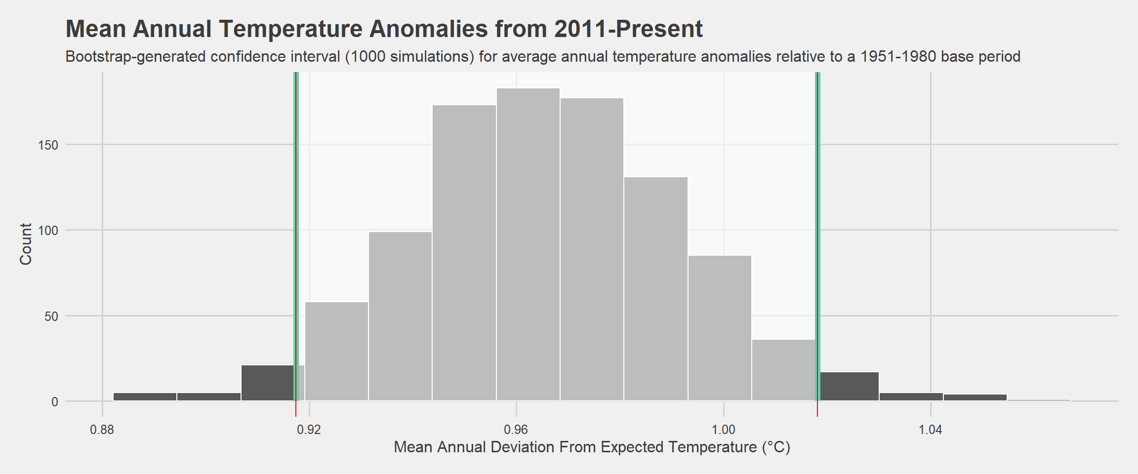
So, is it really getting warm in here?
These investigations demonstrate that monthly temperature deviations, versus a 1951-1980 base period, have been increasing sharply over the past 50 years. While there are no immediately evident patterns in monthly deviations over time, I find that mean deviations vary cyclically, and are greatest in Spring and Autumn months, peaking in March and October. This means that, relative to months in the 1951-1980 period, Spring and Autumn months have seen the greatest temperature increases in recent years. Exploring trends periodically, my initial overview of monthly deviations is ratified by the shifting distributions of monthly temperature anomalies across periods. It is evident that the periods 1981-2010 and 2011-present mark sharp upward deviations in temperature, on average, relative to the 1951-1980 base period, and to an even greater extent relative to the 1881-1920 period. Evaluating anomalies on an annual basis, I find not only that deviations have increased over the overall period surveyed, but that they have been increasing exponentially - the size of temperature anomalies increasing more in the past 20 years than in the previous 100.
Having observed steep increases in monthly temperature deviations over time, as well as periodic and annual deviations, my confidence interval demonstrates that even the most conservative temperature anomalies, of 0.92, are likely to have severe repercussions according to NASA’s historical evaluation. As a whole, this data paints a worrying picture of the future of my planet and the need for urgent action to moderate exponential temperature increases which threaten the habitability of Earth.